Dying Alone in Tokyo, Japan
projects japan geospatialUpdate 2022-07-14: Tokyo Dying Alone has been selected as a featured use of the Tokyo Open Data Catalog.
I recently stumbled on the Tokyo Open Data Catalog, a remarkable initiative by the city to share with the public some of the vast amount of data it collects. Among the more than 4,000 datasets in the catalog, one from the Tokyo Medical Examiner’s Office caught my eye: data about the 120,000 people who have died at home in the city since 2003.
Many of these people lived alone and their deaths were not discovered for several days or more, providing a stunning view into Japan’s lonely death problem (kodokushi mondai, 孤独死問題).
From this data, I built the Tokyo Dying Alone dashboard. This blog post is both a guide to that dashboard and an exploration and analysis of the data. For a technical description of how the dashboard was made, see the code repository on github.
The Data
If you die at home in the city of Tokyo, the Medical Examiner’s Office will view your death as ‘abnormal’ (ijoushi, 異状死) and conduct a post-mortem examination. It will then include your death in aggregate statistics on its website.
For each of Tokyo’s 23 wards and for each year from 2003 to 2019, the office supplies two data tables. The first shows the deaths at home in 5-year age brackets, separately tabulated for men living alone, women living alone, men living with others, and women living with others. The second shows the time it took for the deceased to be discovered — between the estimated date of death and the post-mortem examination — also broken down by sex and household status. In total, 782 data tables cover the deaths of 119,877 people.
For example, the 2018 time-to-discovery table for Itabashi Ward records that 3 men died at home while living with others and yet were not discovered by the city until 8-14 days later. However, the Medical Examiner’s Office does not provide their ages: while the age-bracket table does split the deaths in Itabashi in 2018 by age, the cross-dimension of age-bracket to time-to-discovery is absent.
Aside from the missing age/time cross-dimension, the data gives a nearly complete picture about the sex, household status, age, and time-to-discovery of all deaths at home across all wards of Tokyo for 17 years. To account for the different population of each ward and the population change over time, information about the total number of deaths, including those not at home, can be obtained from the Tokyo Bureau of Social Welfare and Public Health.
The Dashboard
The Tokyo Dying Alone dashboard helps to navigate this large and complex dataset. In addition to presenting charts synthesizing the data, the dashboard allows the data to be filtered along the chart dimensions. The dashboard then responds to that filter, giving a view into a slice of the data.
In this way the dashboard helps to find patterns and trends in lonely deaths in Tokyo. By also integrating the total death information – including deaths not at home – it provides context to the data and to the lonely death problem.
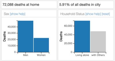
With the dashboard the data can be explored in a huge variety of ways. As the data is filtered, indicators at the top of the page show the total number of deaths at home in the current data slicing and the fraction of deaths at home relative to all deaths.

Two charts below these indicators allow filtering based on the sex and household status of the deceased. These charts can be used to immediately understand that, for example, men are an at-risk population for a lonely death: of the roughly 70,000 people who died at home while living alone, roughly 50,000 were men. Filters can be reset using buttons above each plot, and all filters can be reset simultaneously using the reset button at the top of the page.
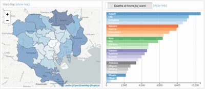
Following these charts is a map of the 23 wards of Tokyo, colored-coded according the number of deaths in each ward as shown in the neighboring ward chart. Hovering over a ward leads all the other charts to immediately respond by showing data from that ward alone, and clicking on a ward then locks this view. At first glance, the outer wards of Adachi, Ota, and Edogawa appear to be the most significantly afflicted by the lonely death problem.
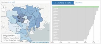
However, this predominantly reflects their larger populations. To account for this, clicking the title of the ward chart divides each ward’s deaths at home by the total number of deaths in that ward, including deaths which do not occur at home, for the relevant time period. This fractional view controls for the differing population of each ward and reveals that in Shinjuku, for example, more than 11% of people die at home.
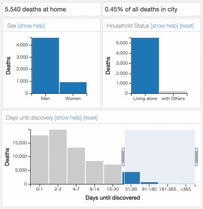
On the second row of the dashboard lie more detailed views into the data. Two charts show the time-to-discovery and ages of the deceased. By clicking and dragging across these charts, multiple categories can be selected at once. For example, of the ~72,000 people who died at home while living alone between 2003 and 2019, it took longer than one month for 5540 of them to be found. 9212 of the 72,000 were younger than 50. Using these charts along with the ward selection shows that, for example, 6.4% of all deaths at home in Shinjuku Ward take at least a couple of days to discovered.
However, the time-to-discovery and age charts cannot be filtered simultaneously: filtering on one chart hides the other, since this cross-dimension is not provided by the public data. Nonetheless these charts offer fascinating views into the data: one interesting feature is the different age distribution in lonely deaths for men and women, as shown in the following charts.
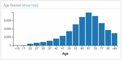
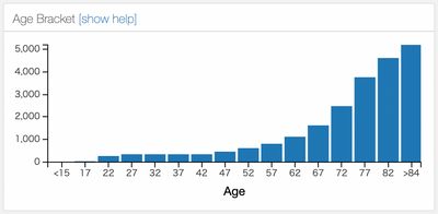
Age distributions of men (top) and women (bottom) who lived alone and died at home
Finally, the number of deaths as a function of time is plotted. Deaths at home have on the whole increased by 70% between 2003 and 2019, a drastic increase that can only partially be explained by the increase in total deaths over that time range as Tokyo’s population grows and Japan’s population ages. This can be accounted for by clicking the chart title to divide the number of deaths at home by the total number of deaths in each year in the relevant wards.
When combined with filters on the other charts, the time evolution chart can be revealing. For example, the number of deaths which take longer than a week to be discovered has increased from less than 800 in 2003 to over 2000 in 2019. This is 1.3% of all deaths in the city in 2003 and 2.5% in 2019.
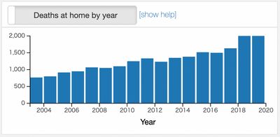
The number of deaths which take over one week to be found has more than doubled in 17 years
Data has a part to play in understanding this important social problem, and surely more insights can be found in this powerful dataset.
Acknowledgements
This project relied on data gathered by Yoshimasa Kanawaku 金涌佳雅, Takanobu Tanifuji 谷藤隆信, Abe Nobuyuki 阿部伸幸, Nozaki Ichiro 野崎一郎, Mori Shinjiro 森晋二郎, Funayama Masato 舟山眞人, and Fukunaga Tatsushige 福永龍繁, of the Tokyo Medical Examiner’s Office.
Tutorials from Adil Moujahid, Nick Hand, and Austin Lyons, and the dc.js and crossfilter Stack Exchange communities including the invaluable contributions by Gordon Woodhull, were essential for learning the tools used here.